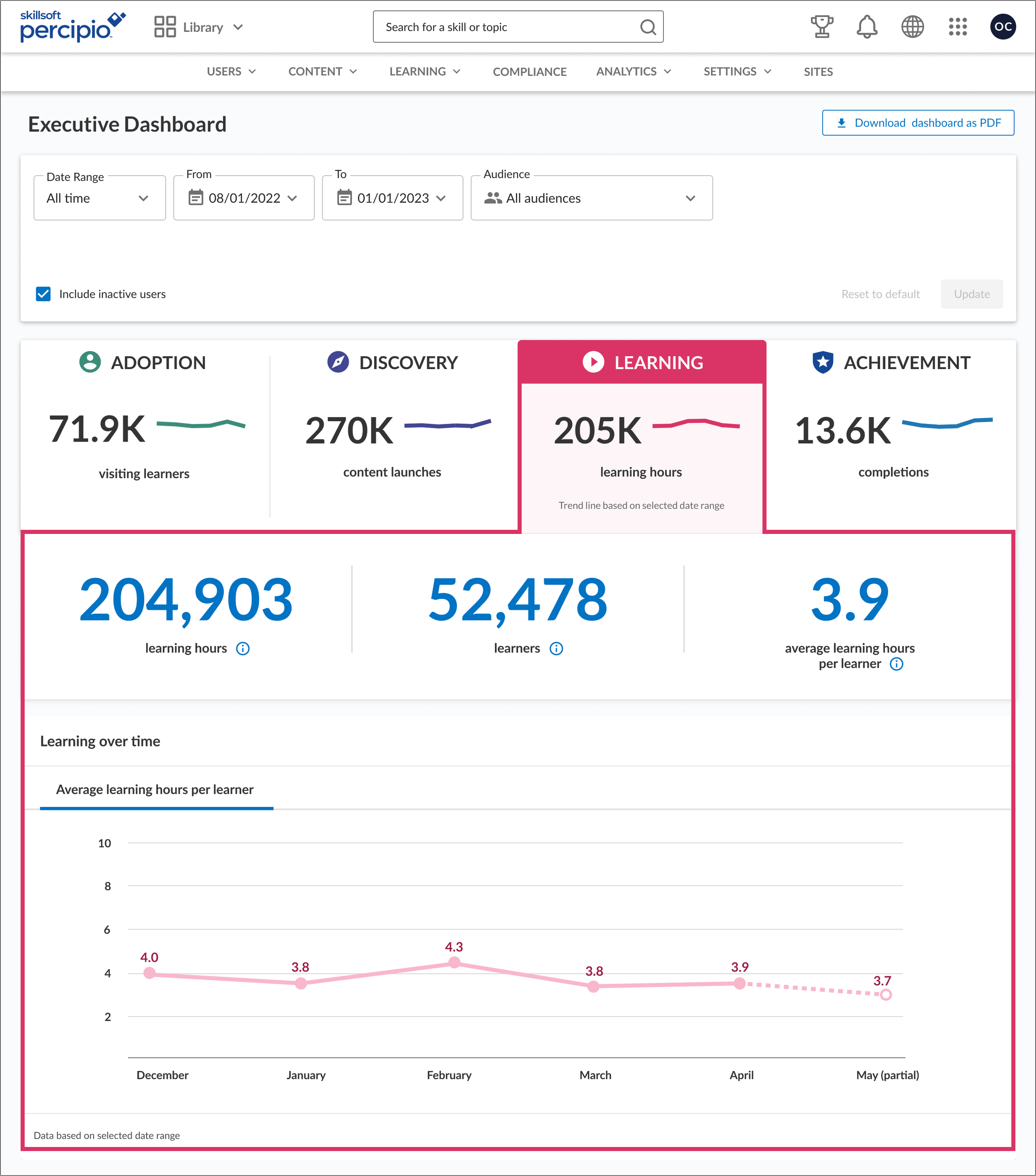
Executive Dashboard
In 2021, I designed a dashboard for Percipio admins to easily access top-level data describing learners at all stages of their experience in the platform.
Company
Skillsoft
Tools
Miro, Figma
Team
1 designer, 2 developers, 1 project manager
My role
UX lead, UX research collaborator
The Executive Dashboard tracks the entire learner experience: from platform adoption, to discovery of content, to time spent learning and finally completion of content.
By drilling into each tabbed section, admins can learn more and have quick insights to how their learners are progressing. This dashboard data can be filtered by date range and audience; audiences are a known feature to admins in which learners are grouped by a variety of .
This is the first dashboard of its design structure in Percipio. I created new design elements such as spark lines and donut charts, as well as updated line charts. I worked closely with developers to achieve the desired look and behavior.
Adoption: This tab displays activity at the first entry point for learners. We see how many learners are visiting the Percipio platform, whether those learners are returning learners or new, and whether they're on a mobile or desktop computer.
Discovery: Content launches describes how many pieces of content were launched in a certain time frame and by how many learners.
Learning: This tab displays how many hours learners spend on the content over a set time frame.
Achievement: The last step in the learner journey. This tab displays the completion rate over a set time-frame as well as the number of badges earned by learners in that time.


